Delivering a comfortable user experience is a key factor to ensure the success of a software application. Although user experience is important for any kind of application, designing mobile applications and websites requires extra care. Mobile devices are frequently used “on the go”, while the user is performing other tasks at the same time. Therefore, mobile applications must be easy to use and self-explanatory. A mobile application or a web page should be readable even in direct sunlight, a condition which causes mobile displays to exhibit poor contrast and colour fidelity.
Moreover, mobile devices come in every possible shape and size. Ensuring an application will work correctly independently from the screen size or aspect ratio is actually quite hard. While responsive designs are a possible solution to this problem, they are often misused, causing important elements of the user interface to disappear when they should not.
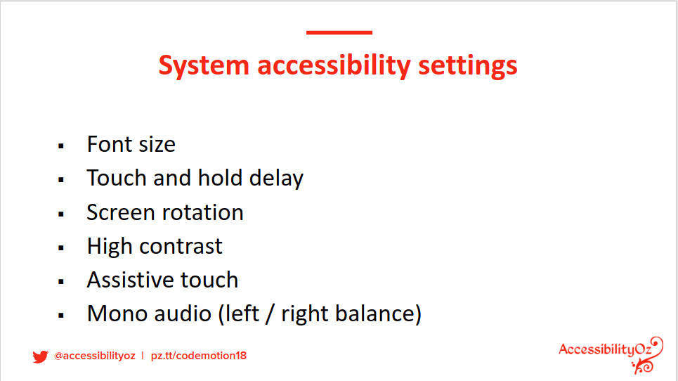
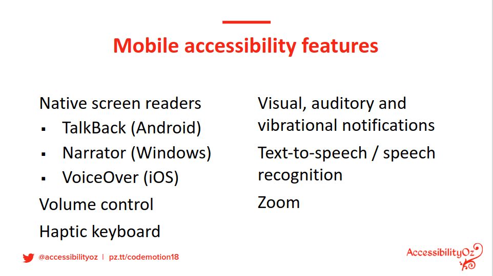
Aside from the technical issues, users also come in different shape and sizes. Our application may be used by people affected by visual or hearing impairments, dyslexia and so on. Accessibility frameworks and best practices provide technical solutions to ensure these people can still use mobile applications despite their impairments.
As an example, ensuring images have an alternative text allows screen readers to describe a web page. Avoiding certain colours for control elements (buttons, links, etc. ) may help colourblind users.
As a worldwide expert on web accessibility who contributed to the definition of the Web Content Accessibility Guidelines (WCAG), Gian Wild, from AccessibilityOz, shared her experience on the topic at Codemotion Milan 2018.

Talking about the modern challenges in the design of accessible and inclusive applications, Wild introduced the latest version of the WCAG documents, 2.1, that provide a series of rules explaining how web content should be formatted and delivered to be more accessible to people with disabilities.
Aside from general design principles, the WCAG specifications also provide specific guidelines to tackle the most common issues regarding content navigation, as this is one of the main factors affecting the user experience.
Without going into too much detail, a simple rule of thumb to strengthen the reliability of a navigation system is to ensure that the same part of the user interface (e.g. a link on a web page) can be accessed via different means (e.g. a mouse click, a touch of the screen, a focus change using the TAB key). When failing to do so it is likely to produce the so-called “traps“. A trap is basically a state of the user interface that can not be reverted. As an example, a very common case of a trap happens when the screen keyboard covers an input element and cannot be closed.

Ensuring an application meets all the criteria enlisted in WCAG is a complex and long process, especially if the application was not designed with WCAG in mind. The market offers several test suites that can be used to automate this process. These tools can generate extensive reports enlisting all the missing features and suggesting the actions to take to be compliant with the guidelines.
Aside from accessibility issues, achieving a great user experience is a matter of testing. Ensuring content is delivered correctly on the plethora of mobile devices available on the market can be extremely challenging. Wild shared her methodology for mobile testing, which consists of two main steps. The first one focuses on designing the tests, identifying the devices and the user interface variations of interest. In the second one, the actual tests are conducted on real devices focusing on mobile interaction, support for assistive technologies and more.


