Over 204 million people aged 14 and over will make a purchase online in 2020. E-commerce is a vast business and it is more than likely that you will be called upon to design a website for the world’s biggest marketplace.
As with any project, it’s important to understand the objective and how to obtain it. Your aim should be to create the best possible user experience ensuring your client, the business owner, can sell their product.
Before you begin to think about your design, you need to familiarize yourself with the business itself. Aim to get to know your client, what they do and their product. You’re likely to be working remotely, so make sure you have a clear line of communication for any important questions.
While email and fax can be effective (and mean you have the requests in writing!), they’re not always the quickest routes. Instead, try a video call or dial in conference call. The more information you can get in this one conversation means less of those tedious email threads.
Now you have an understanding of the business and it’s goals, it’s time to get down to your design. So, here are a few pointers to get you started.
10 Tips for your next e-commerce web design project
Branding
Forbes discovered that having a ‘consistent brand presentation across all platforms increases revenue by up to 23%’. Presenting your brand consistently across all platforms really does equate to revenue for your client. Your e-commerce website design should be an extension of the brand you are working with.

It’s easy to think that using a logo a few times means you have brand consistency. In reality, branding is an important marketing strategy, so this approach just won’t cut it. To execute real brand alignment, it is important to communicate with your client. Establish their aesthetic and how they present themselves to customers. Focus on both what they do and how they do it.
Before starting the project, collect assets from your client. Using their desired font, color schemes and logo will establish your website as a branch of their business.
Photography
Images are key to e-commerce web design. Customers make purchases based on what the product looks like as well as the technical description provided. In fact, the online shopping portal Etsy discovered that ‘90 percent of shoppers said the quality of the photos were “extremely important” or “very important” to a purchase decision.’
You may feel that taking good quality photos of products isn’t your job description and you would be right. But take a step back and think of the bigger picture. Your work is going to be your portfolio. Would you want your future clients to judge you on how this website appears?
It is important to review and discuss the assets you will be using with your client. Explain how good quality images mean more than a pretty photo, suggest the use of videos and stress the importance of updating and rotating photos. Top project management tools can be used to remind you and your client when assets are due for delivery, and you can provide feedback as needed.
Text
Text is, of course, necessary to an e-commerce site. Despite that, many people get it wrong. We’ve all seen novels describing the smallest product or one line to summarize the new gadget you are going to be spending a lot of money on. There is a fine line to tread when it comes to text.
As with images, it’s not your role to write the content for the site. However, having a strong understanding of what works and what doesn’t can help you build the site appropriately.
A simple checklist could be as follows:
- Content. The information should be concise. Tell the customer enough about the product. If everything is communicated then there should be no reason for the customer to contact the client.
- Positioning. Ideally fit the product information next to the image. Any scrolling to find it could turn customers away.
- Size. This should be clearly legible and large enough to read at a glimpse.
- Font. There are thousands of fonts to choose from but the one you use should always be in line with your client’s branding. If they haven’t provided a font then establish one and use it consistently.
Brand stories or ‘about’ text are common, but it should have its own page. Trying to add too much to a product page can be distracting. Instead, leave space for reviews. Reviews can help customers decide on their purchase. The closer to the product image the better.

Minimalism
You may know minimalism as an art or architecture movement, but the term is far broader. There are key principles of minimalism that you can use in your e-commerce website designs.
Simplicity and functionality are key to modern web design. Be creative with your use of space and how the users will interact with it. When adding assets, ask if they’re needed. Are they adding anything to the design? What will including it do for you and your client? If there’s no clear purpose, then perhaps it is best left for another use.
A minimalist design will also benefit the customer experience. With fewer distractions, websites become easier to use. Visitors want a site that is easy to navigate. If you allow them the best and simplest environment to do so then they will come back.
Checkout
The checkout icon is, well, iconic. It could be a small shopping trolley or a basket, but we all know what it means when we see it. The problem can sometimes be not seeing it at all.
Almost 70% of online shopping carts are abandoned online. This statistic shows just how important it is to give customers the option to buy what is in their cart. You could be a professional developer or web designer but if you don’t integrate this into your next design then it could mean loss of revenue for your client.
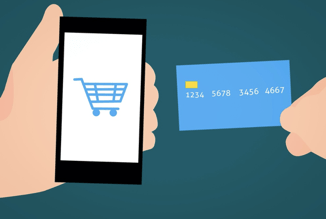
Display your checkout icon clearly. The top right-hand corner is the usual place to start but you don’t have to stop there. Position it near a product and consider allowing it to move when the customer scrolls. You can even have it pop-up whenever an item is added, automatically giving customers the option to go to their cart straight away.
Search bar
There is a reason Amazon has its search bar up top and in plain view. It is easy to find. Statista found that 61% of people said search and navigation and the ease of finding products was one of the most important factors of the online shopping experience.
Make your search bar easily accessible. Don’t let it hide behind anything. Most people already know what they want, so help them to find their product easily.
It’s not just the search bar that this applies to. Dropdown menus should be easy to navigate. This means more concise options, and often, less of them. Customers want to be able to find things – any complication of this process can and will turn people away.
Contact Methods
Customer to vendor contact is still incredibly important. A company that is easy to contact is automatically more trustworthy and occasionally, people just want to talk to other people.
Allow a whole, easy to locate contact page. Include email addresses, an email query box, live chat and a good old-fashioned phone number. More recently, VoIP providers are becoming ever more popular with business contact.
What is a VoIP provider? A Voice Over Internet Protocol provider will allow any business to take and make secure calls using their internet connection rather than a landline. The security of customer contact must be paramount.

Of course, you should always include social media links, just don’t let them get in the way of the products. Usually the customer will already be aware of your clients social media presence before their purchase. To avoid clutter, include them at the bottom of the page.
Testing
Testing seems like an obvious process when building and designing a website, but you’d be surprised how little people use this process to their advantage.
Before going live you should always test. Test the site yourself, get your client to test the site, allow outsiders to test it and most importantly? Test the purchase functions. There is nothing worse than issues with your site on the first day of launch.
Testing isn’t just about functionality, however. It can also be useful in making decisions about the design of your e-commerce website. If you’re not sure where to put your checkout icon, ask others for input. Show them two options, and see which one they prefer. This allows potential customers to guide your web design.
When collaborating throughout testing it can quickly become confusing. Be sure to keep up to date with your clients desired changes and the tests your co-workers have done. Workforce optimization systems can be useful to track progress and make real time decisions throughout testing, allowing for a more efficient process.
Speed
Speed really can be key to your e-commerce web design. Around 40% of people abandon a website that takes more than 3 seconds to load. Those people could become valued customers, and abandoned visits to the site means loss of revenue.
It isn’t only page load time that you need to be conscious of. Your website speed or the times it takes for each website page to be downloaded from its hosting server and displayed in a user’s browser is also vital to retaining your client’s customers.

Some of these speed issues will be down to internet providers, but there are ways you can help. Using fewer images and videos will speed your website up, but it is important to keep a healthy balance. You don’t want to sacrifice quality for speed, after all. When using images and videos try to optimize their size as much as you can without losing too much quality.
Be device friendly
There are many different types of customer. Some prefer to use a desktop computer, others their phone, whilst many still enjoy a brick and mortar store. Most people, however, will use a range of shopping methods. These customers are called omnishoppers. They use desktop computers, laptops, phones and any other electronic device to access the website you have created.
People who had a negative experience on a mobile device are 62% less likely to purchase from that site in the future. It’s not enough to have a great desktop site – it also needs to be designed to work on a mobile device. Some common problems include:
- Do images and videos load properly?
- Can you see your basket icon easily?
- Are the multiple payment types available?
- Do navigation menus obscure products?
- Has the text held its position?
Finally, check your browser. Optimizing for different devices is at the top of the list for any e-commerce web design project, but people often neglect the effect of web browsers on a page. Double and triple check your site will properly load on any given browser. It won’t take long but will save you time in the long run.
Communicate
All of these design tips are important, but don’t forget about communicating with your team and your client. Close contact with the business owner will ensure you have everything you need to complete your build but also gives you the ability to share progress on the project. If you are struggling in this area there are various communication tools and video conferencing software to keep you, your co-workers and your clients on track throughout the project.
Finalising Your Design
By incorporating these ten points in your next e-commerce web design project you will deliver a customer friendly portal to your client’s business. Ultimately, the efficiency of your design will mean more sales. A good product coupled with your reimagined design will lead to customer retention.
In return, of course, aside from your fee and a happy client, a good website displays your skill and acts as a portfolio allowing future clients to see just how good you are.

