
So you’ve been out, you’ve conducted the surveys, you’ve collected a giant pot of data that unequivocally demonstrates your position and now it’s time to present. How do you do it? Well you could just dump the raw spreadsheet at the desk of your manager or whoever it may be, declaring ‘it’s all there!’, triumphantly. Or maybe organize a teleconference or web meeting where you rattle off data points hour after hour.
Of course, these are intentionally ludicrous suggestions. The key to communicating the meaning of data to those who need to understand it is to provide an effective, compelling, and easy-to-interpret visualization. In the data-driven culture in which we live, being able to communicate data interpretations in this way is an essential skill for any business person to have.
Let’s outline five basic rules of engagement for data visualization.
Number 1: What’s the point?
Don’t worry you’re not seeing signs of an existential episode, our first point indeed is – what is the point? You ought to determine what point you are attempting to make with your data before you take the step to visualize it. Without this step things will get messy and confusing.
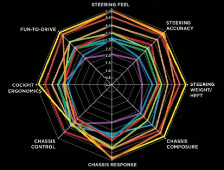
Consider the above infographic. What is the point? What message is the analyst who built this graph trying to tell us? If there ever actually was one, it has been lost to the sea of potential interpretations an audience member could impose onto it. It is necessary to minimize this risk of alternative interpretations of your data visual if you want to deliver a concise message.
Ask questions, get answers
A way to do this is to identify particular questions that your data can provide an answer to. For example, imagine you have collected a large sample of data regarding the varying success of a particular ad campaign across numerous media. You now have the information necessary to assess the relative success of the various media. Now ask your questions.
You can ask this data, which is the most successful advertising medium of all? Is it TV, social media, enterprise e-commerce platforms, radio, or something else?
Think of this as a surface-level, fundamental question where there is a clear and direct association between the data and the interpretation applied to it. For example, perhaps the initial data shows that social media is the most effective of the channels due to its superior success rate against the rest. There is no further analysis to be done in order to answer the question we set out to answer. No reasonable person could deny the interpretation that social media is superior.
Thereafter, you may then explore secondary interpretations that can be inferred from the data. Maybe you also collected personal data from successfully onboarded customers within each of the media. Then, you can assess the success rate of particular media among specific demographics. This would constitute an additional layer of analysis and therefore your visualization will need to be more sophisticated.
Layers of data interpretations can build up in this way, so – depending on what question you’d like to see answered and demonstrated to your audience – you will need to find the most appropriate way of presenting these layers of information.
Generally, deeper levels of analysis will require a more sophisticated visualization than more direct data sets.
Number 2: Know your options
When it comes to data presentation, you have a variety of options. Try and get familiar with the various ways data can be visualized. Let’s just very quickly take a look at a few of these ways, and how they are best used.
Data visualization with bar graphs
Perhaps the most familiar of data visuals is the bar chart or bar graph. It is used when measuring the variability of a single factor between different categories.
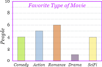
The above provides a rudimentary example of a bar chart. As described above, you can see that there is one variable that is being measured (number of people) and the graph provides a mode of comparison between a given set of categories (favorite type of movie) listed across the bottom.
The bar graph is useful when making a basic comparison between categories in order to determine which is the best or worst option.
Data visualization with histograms
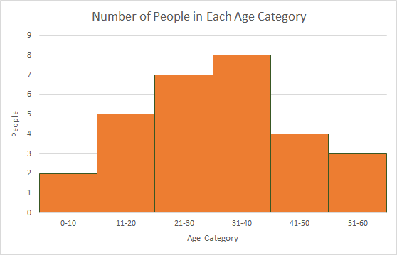
The above image is an example of a histogram. It is similar to a bar graph in aesthetic, but the type of data used with histograms differs. Whereas in a bar graph the categories are distinct, in a histogram the categories are ranges from a continuous data set. It consequently demonstrates proportional prolificacy of the separate ranges.
The continuous nature of the data is indicated by the lack of gaps between bars.
You should use a histogram if you are looking to compare two continuous sets of data and want to categorize groups within one of those sets.
Data visualization with line graphs
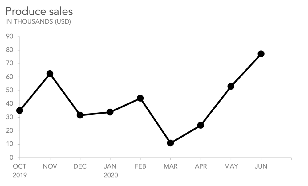
A line graph shows the differences in one variable (y-axis) in relation to an independent continuous variable; usually time (x-axis). They are useful for identifying trends and patterns in data and can be used to show how one independent variable affects multiple things at a time.
For example, you could use the same graph to show the amount of annual rainfall in different areas of the country, with each area being represented by a separate line. Line graphs should be considered if you have a lot of data to present.
Data visualization with pie charts
Pie charts are a way of demonstrating the total distribution of all your data points among different categories. They should be used as an alternative to a bar graph if you are more interested in showing the proportionality of your results than the relative amounts. For example, it may be useful to employ a pie chart if you are looking to personalize marketing techniques and need to assess the proportion of your customers who are positively affected by personalized ads.
Summary: which chart for your data visualization
These four are perhaps the most common, but there are many more and it may be worth your while to research into the different options. Your decision as to what is the best visualization format to use will be informed by the characteristics of your data.
Number 3: Understanding your data
Right, so you know what questions you want your visuals to answer, and we’ve looked at a few of the available options for representing those answers. Now you have to make a decision. This will come down to the characteristics of the data and the variables you need to display.
Types of variables
Variables come in two major types – independent and dependent variables. Broadly speaking, the independent variables are the things that we change and the dependent variables are the things that we measure. We are measuring the effect of the independent variables on the dependents.
For example, if we are assessing marketing communication tools, the tools themselves would be independent variables. Their success rates would be the thing we measure and, therefore, the dependent variable.
It is important to make these distinctions as different visualization methods will suit certain arrangements better. Bar graphs and pie charts, for example, are great ways to show proportions between independent categories against a dependent variable.
Types of data
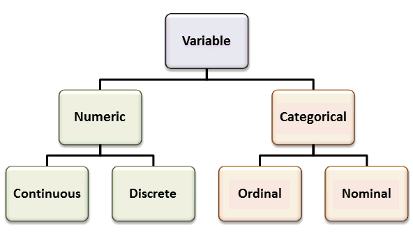
Data can be either qualitative or quantitative. But within each of these there are multiple different forms data can take.
Qualitative
Qualitative data is data that is subjectively judged or grouped into categories. Specific types include:
- Binary – When the data fits into one of two categories. E.g., Do you know how to send a fax online? (Yes/No)
- Nominal – data that’s fitted into categories with no implicit hierarchical order or rank. E.g., methods of talent acquisition
- Ordinal – data that’s fitted into categories with an implied order. E.g., size
Quantitative
Quantitative data is data that can be measured in an objective way and can be represented using numerals. There are two types:
- Discrete – Numerical results that can’t logically be made more precise. E.g., number of targets an email blast service can have – it needs to be a whole number.
- Continuous – numerical results that can conceivably be more and more precise. E.g, the speed at which different call center solutions can connect customers to agents.
Application and purpose of data visualization
Apply your knowledge of the qualities of your data when deciding what type of visualization to use. When using categorical quantitative data, you will find that a bar graph or pie chart is a more appropriate visualization for analyzing the distribution of that data. Whereas, if you are looking to analyze small fluctuations in data over a continuous period of time a line graph is more suitable.

Number 4: Aesthetic of data visualization
Your data visualization should be clear, concise, and aesthetically satisfying. Not only will this mean that your presentation will be more engaging for your audience, they will also be more receptive to your message.
It has been suggested that we have two systems for decision making. System one is quick and instinctual, while system two is slow and deliberate. Your data visualization should be presented in such a way as to appeal to your audience’s system one decision making. This means minimal room for interpretation and an unambiguous message.
Describe your data
While it’s important for your graphics to communicate an idea without words, words will help clear up any lingering doubt. So, annotate your diagrams directly (without a key) and use sub-headings and callout boxes to accurately describe what exactly is being shown.
Be sure to use a simple and legible font that doesn’t distract from the message you are trying to convey.
Visual Hierarchy
There will be parts of your design that should demand more attention than others. Key results and trends should be accentuated so that they can’t be missed. Say, for example, you’re trying to ask ‘how does virtual phone service work compared to traditional phone service?’. Then, you ought to bring attention to the pertinent data that highlights the differences in performance between the two service types.
Elements of your presentation should be represented according to a visual hierarchy – with the most important elements at the top and the least important at the bottom. Once you’ve ordered the elements in this way you can vary the following qualities accordingly to grant them the appropriate level of distinctiveness:
- Size – more important elements can be enlarged while less important elements kept small or even omitted.
- Color/contrast – Brighter colors stand out more.
- Perspective – Blur and shading can make certain elements seem further away or non-important.
- Space – elements that are separate will be noticed first.

Another tip is to try to be minimalistic; you don’t want anything in your graph that isn’t absolutely necessary and has the potential to distract or confuse the viewer. Things like grid lines should be muted or deleted for this reason.
Number 5: Introduce your work to criticism
Feedback is hugely significant for data visuals. When you’ve been working on something continually for a few days you can develop tunnel vision and lose track of whatever it is you are trying to convey. A simple demo on a group of colleagues or friends is a great way to gauge the immediate response that your design elicits.
Remember, we’re looking to engage that instinctual system one thinking. So, it’s bad news if your demo audience stands there squinting at your production for five minutes trying to work out what it means. You want them to be immediately compelled into your way of reasoning by the irrefutable data.
Feedback notifies you when you’re trying to cram too much information into one visual device. Or, it can let you know if there’s not enough context for the meaning to become apparent.
In short, listening to feedback is potentially the most important step in the entire process as it makes you carefully reconsider all the previous points made. You should regularly take a step back and conduct these feedback sessions throughout the process. This way you can be sure that your end product will have the impact that your arduous data research merits.


