
Introduction
Unsupervised learning is a machine learning technique that is not supervised by humans.
In supervised learning, data scientists gather the data from a source. These data are labeled, meaning: data scientists use them to make predictions. In other words, they know the right answer that an ML model has to arrive at, so data scientists evaluate how good is that model to arrive at the right answer.
So, in supervised learning, data scientists use the data they have to train machine learning models so that they can make accurate predictions on new, unseen data.
Unsupervised learning, instead, works on a different process. There’s still a human intervention, of course. For example, to retrieve and clean the data. However, data scientists use unsupervised learning to explore the structure of their data and extract meaningful information from it.
There are two types of unsupervised learning:
- Clustering.
- Dimensionality reduction.
This article is an introduction to clustering analysis to find meaningful information in the data.
Introducing clustering analysis
Clustering is an exploratory data analysis technique – often called pattern discovery technique – that allows us to organize data into meaningful subgroups – called clusters – without having prior knowledge of the groups’ memberships.
On a practical side, we feed an ML model with the data we have and it will be able to find the meaningful connections between the data, allowing the subgrouping. Here’s how a clustering technique would show the clusters on a given set of data:
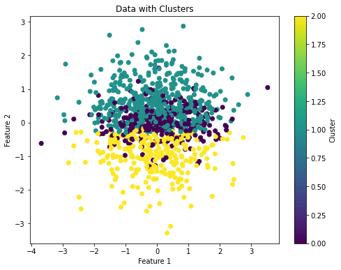
The above image shows that the algorithm found three clusters on the given set of data and it shows them with different colors.
So, each cluster that arises during the analysis defines a group of objects that share a certain degree of similarity. These are also dissimilar to objects on other clusters, and tht’s why this is an unsupervised process.
So, clustering analysis is a great methodology for structuring information and deriving meaningful information from data.
It can be used with a plethora of goals in mind. For example, it can be used by marketers to discover customer groups based on their interests. It can also be used by data scientists to define the labels of a given set of data to be used to make predictions. In other words, there are cases where the labels are not clear or known and we can use clustering to define them.
The typical clustering techniques are:
- k-means clustering.
- Hierarchical clustering.
- DBSCAN.
This article focuses on k-means and hierarchical clustering.
An introduction to popular clustering algorithms in Python
In this section, we’ll describe how k-means and hierarchical clustering work. We’ll also implement examples in Python to show how to use them.
K-Means clustering
The k-means clustering algorithm belongs to a category called prototype-based clustering.
In this category, a cluster is represented as a prototype which is usually the centroid (the average) of similar points in the case of continuous features, or the medoid (the most representative or the point that minimizes the distance to all other points that belong to a particular cluster) in the case of categorical features.
The k-means cluster algorithm is very good at identifying clusters with a spherical shape, but one of its drawbacks is that we have to specify the numbers of clusters, k, a priori.
An inappropriate choice of k can result in poor clustering performance, but there are methods to evaluate the quality of a cluster that help us determine the optimal number of clusters, k.
When we refer to the “spherical shape” of a cluster, we mean that the data points within a cluster are distributed in a manner that resembles a three-dimensional sphere (or a two-dimensional circle). In other words, the points in the cluster are tightly packed around a central point, and the distances from this central point to the data points are roughly equal in all directions.
Here’s how a spherical and non-spherical data distribution appears in two dimensions
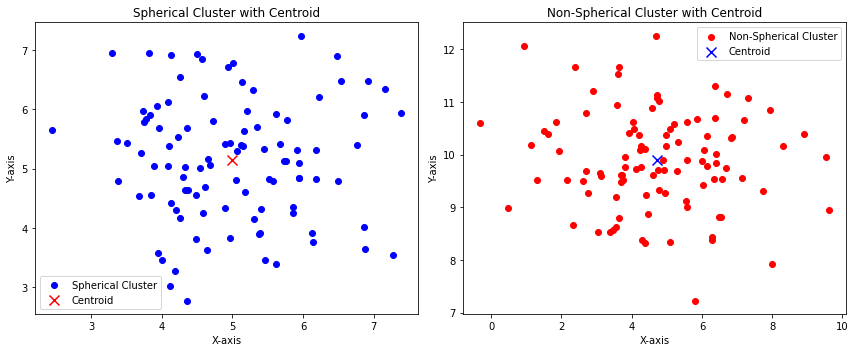
The above image shows that:
- The blue points are somehow distributed with specular distances among the center of the distribution (the centroid). This can represent a spherical cluster.
- The red points are somehow not distributed with specular distances among the center of the distribution (the centroid). This can represent a non-spherical cluster.
Now we want to extend the concept related to distance. The above example shows only one cluster for the purpose of visualizing a spherical and a non-spherical distribution.
So, let’s create a dataset consisting of 150 randomly generated points grouped into three subgroups. We can use the following code to do so:
from sklearn.datasets import make_blobs
import matplotlib.pyplot as plt

# Create 3 clusters with 150 randomly generated data points and 2 features
X,y = make_blobs(n_samples=150, n_features=2, centers=3, cluster_std=0.5, shuffle=True, random_state=0)

# Plot the points as a scatterplot
plt.scatter(X[:,0], X[:, 1], c="white", marker="o", edgecolor="black", s=50)

# Write labels, show grid and plot
plt.xlabel("Feature 1")
plt.ylabel("Feature 2")
plt.grid()
plt.tight_layout()
plt.show()Code language: PHP (php)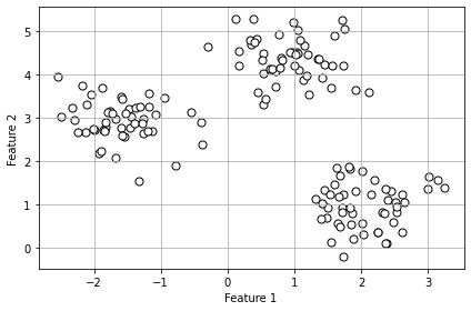
Now, in real applications, we don’t know how many clusters the data can be divided, which is the k value we have to find, as we said before. To do so, we can follow these steps:
- Randomly pick k centroids from the examples as initial cluster centers.
- Assign each example to the nearest centroid 𝜇(i),j ∊ [1,…,k]
- Move the centroids to the center of the examples that were assigned to it.
- Repeat steps 2 and 3 until the cluster assignments don’t change or a user-defined tolerance or maximum number of iterations is reached.
Now, how do we measure the similarity between objects?
If we’re evaluating car colors, for example, the human eye can say that an orange car is similar to a red one. But how can we define similarity in mathematics?
We can define similarity as the opposite of distance. A distance metric quantifies the dissimilarity or distance between two data points. The smaller the distance between two points, the more similar they are. The larger the distance, the less similar they are. So, in this sense, “similarity” and “distance” are inversely related: smaller distance implies greater similarity, and larger distance implies less similarity.
A commonly used distance in clustering with continuous features is the squared Euclidean distance between two points, x, and y:

So, based on this metric, the k-means clustering can be described as an optimization problem: it’s an iterative algorithm that minimizes the Sum of the Squared Errors within a cluster.
We won’t go any further with the mathematics in this article. So, let’s implement a k-means clustering algorithm in Python:
import numpy as np
import matplotlib.pyplot as plt
from sklearn.datasets import make_classification
from sklearn.cluster import KMeans

# Generate data
X, y = make_classification(n_samples=1000, n_features=20, random_state=42)

# Create a K-Means clustering model
kmeans = KMeans(n_clusters=3, random_state=42)

# Fit the model to your data
cluster_labels = kmeans.fit_predict(X)

# Create a scatter plot for the first two features
plt.figure(figsize=(8, 6))
plt.scatter(X[:, 0], X[:, 1], c=cluster_labels, cmap='viridis')
plt.xlabel('Feature 1')
plt.ylabel('Feature 2')
plt.title('Data with Clusters')
plt.colorbar(label='Cluster')
plt.show()

Code language: PHP (php)
So, with from sklearn.cluster import KMeans we import the k-means model from sklearn. Then, we can manage the number of clusters by changing the parameter n_clusters.
Hierarchical clustering
Hierarchical clustering is a technique used to group data points into nested clusters or a hierarchical structure. It’s particularly valuable when we want to explore the data’s organization at various levels of granularity.
Two great advantages of hierarchical clustering are:
- The possibility to plot the dendrogram. This is the visualization of a binary hierarchical clustering and can help with the interpretation of the results.
- There’s no need to specify the number of clusters.
The two main approaches in hierarchical clustering are:
- Agglomerative. We start with each example as an individual cluster and merge the closest pairs of clusters until only one cluster remains.
- Divisive. We start with one cluster that encompasses the complete dataset, and we iteratively split the cluster into smaller clusters until each cluster contains only one example.
In this article, we’ll consider agglomerative hierarchical clustering.
The two standard algorithms for agglomerative hierarchical clustering are:
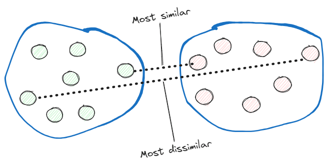
- Single linkage. This computes the distances between the most similar members of each pair of clusters and merges the two clusters for which the distance between the most similar members is the smallest.
Complete linkage. Instead of comparing the most similar members, it compares the most dissimilar ones to perform the merge.
Now, let’s implement an agglomerative hierarchical clustering with the complete linkage approach in Python:
import numpy as np
from scipy.cluster.hierarchy import linkage, dendrogram
import matplotlib.pyplot as plt

# Create a synthetic dataset with 20 features and 200 data points
np.random.seed(0)
X = np.random.rand(200, 20)

# Perform hierarchical clustering with complete linkage
linkage_matrix = linkage(X, method='complete', metric='euclidean')

# Plot the dendrogram
plt.figure(figsize=(12, 6))
dendrogram(linkage_matrix, truncate_mode='lastp', p=20, leaf_rotation=90., leaf_font_size=8., show_contracted=True)
plt.title('Hierarchical Clustering Dendrogram with Complete Linkage')
plt.xlabel('Data Points')
plt.ylabel('Distance')
plt.show()Code language: PHP (php)
So, we’ve created a dataset with 200 random points and 20 features with the method np.random.rand() and we created the hierarchical cluster with the method linkage() from the SciPy library.
This results in the following dendrogram:
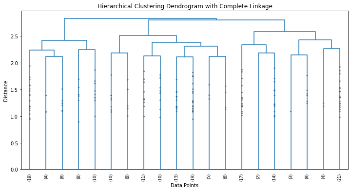
So, a dendrogram is a tree-like diagram used to visualize the relationships between data points in a dataset. It displays the hierarchy of how the data points are grouped together based on their similarity.
Here’s how to interpret the dendrogram obtained in the above example:
- Vertical Lines (Branches). They represent individual data points initially. As we move up the dendrogram, these lines start to merge into clusters.
- Horizontal Lines (Links). The horizontal lines connecting the vertical lines represent the merging of clusters. The height of these lines corresponds to the dissimilarity between the merged clusters. The taller the line, the greater the dissimilarity between the clusters being merged.
- Clusters. The leaves of the dendrogram are individual data points. As we move up the dendrogram, clusters are formed by merging data points or smaller clusters. The branches at the bottom of the dendrogram represent the finest level of clustering (individual data points), while branches at higher levels represent larger clusters formed by merging smaller ones.
- Cutting the Dendrogram. To determine the number of clusters, we can draw a horizontal line (often referred to as a “cut”) at a certain height on the dendrogram. The number of clusters is determined by the number of times the horizontal line intersects the vertical lines. Each intersection point corresponds to a cluster.
We can cut a dendrogram with the following ideas in mind:
- If we cut the dendrogram at a high level (tall horizontal line), we get a smaller number of larger clusters, which are more dissimilar to each other.
- If we cut the dendrogram at a lower level (short horizontal line), we get a larger number of smaller clusters, which are more similar to each other.
In our case, we want the more dissimilar ones as we’re using the complete linkage method. So we can choose three as the number of clusters.
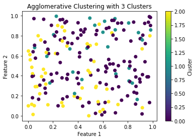
Now we can use scikit-learn to apply a hierarchical agglomerative cluster with 3 clusters:
import numpy as np
from scipy.cluster.hierarchy import linkage, dendrogram
from sklearn.cluster import AgglomerativeClustering
import matplotlib.pyplot as plt

# Create dataset with 20 features and 200 data points
np.random.seed(0)
X = np.random.rand(200, 20)

# Perform hierarchical clustering with complete linkage
linkage_matrix = linkage(X, method='complete', metric='euclidean')

# Specify the desired number of clusters
n_clusters = 3

# Create an Agglomerative Clustering model
agg_cluster = AgglomerativeClustering(n_clusters=n_clusters)

# Fit the model to the data and get cluster labels
cluster_labels = agg_cluster.fit_predict(X)

# Plot the data with cluster labels
plt.scatter(X[:, 0], X[:, 1], c=cluster_labels, cmap='viridis')
plt.title(f'Agglomerative Clustering with {n_clusters} Clusters')
plt.xlabel('Feature 1')
plt.ylabel('Feature 2')
plt.colorbar(label='Cluster')
plt.show()

Code language: PHP (php)
And we get:
Conclusions
In this article, we’ve described clustering as an unsupervised learning technique.
We’ve also shown two clustering methodologies with implementations in Python:
- K-means clustering.
- Hierarchical clustering.
These are the right methodologies to find hidden structures and connection between data during the exploratory data analysys phase.
References:
[1] Machine Learning With PyTorch and Scikit-Learn – Sebastian Raschka, Yuxi Liu, Vahid Mirjalili


